Barcodes!

Yes you can tell I’ve been doing a bit of Book Covers rather than writing.


What’s up with Barcodes?

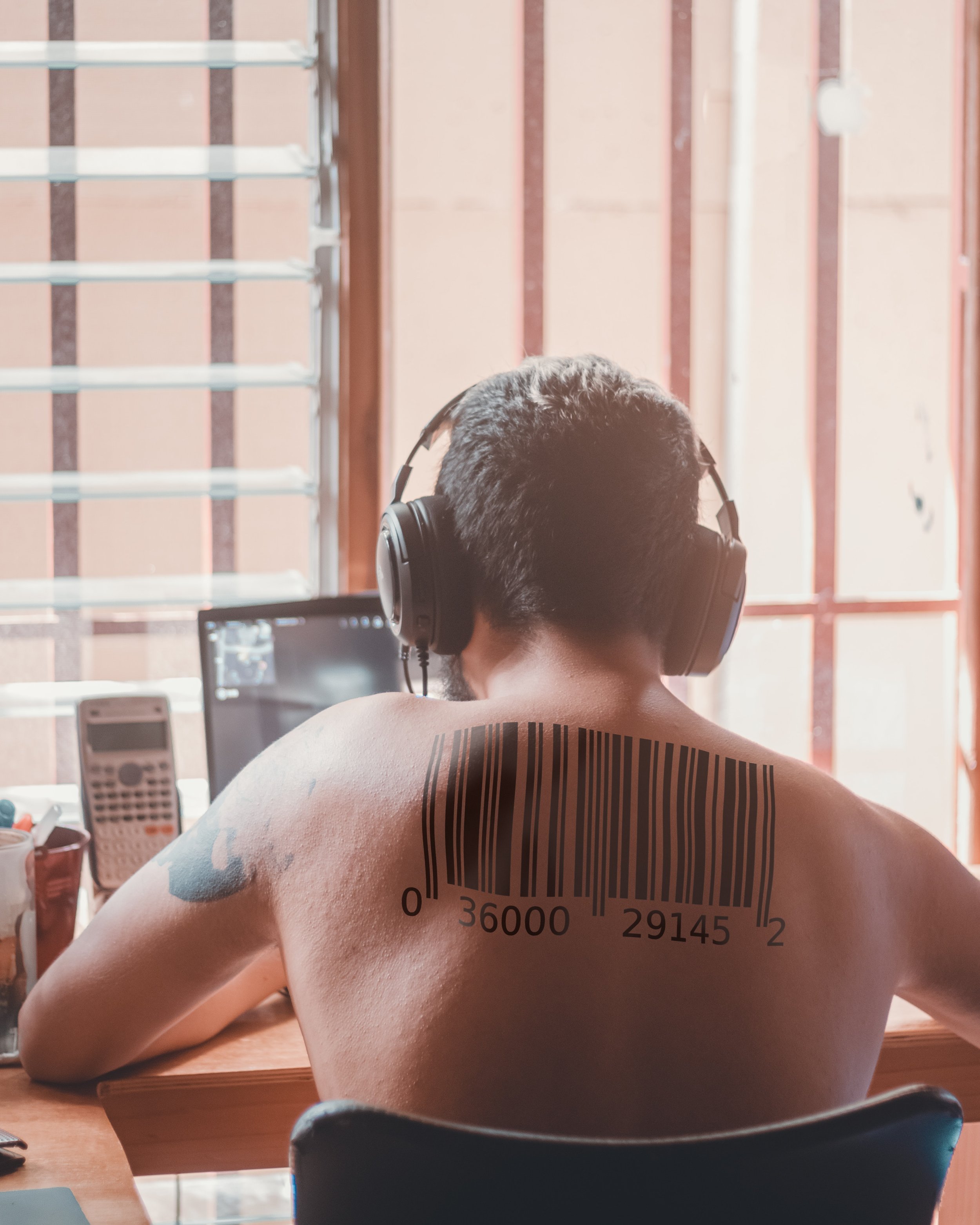
Barcodes have information about your book for stores to scan. Usually it’ll be your ISBN number, and if you see a 5 digit number next to that, that gives pricing info. (usually you’ll see 90000 which means no price details in this barcode)

So when you publish your book, you’ll need an ISBN number.

You can get this in various ways. Depends on your country. Best way to find out is to google how to get ISBN number in your area. For example, in my country you can get a free one as long as you give a copy of the book to the national library.

And… how does this relate to my book cover?

(Why do I always make these questions sound so… sassy?)

Let’s keep it simple. Do you have a barcode? (You can get one by providing your ISBN number to various online pages), then give that to your book cover artist.

Follow this step:

Do you have a ISBN number?

Yes No

Is it a Free KDP one? Either stop here? Or get one/ free one from KDP

Cool you can ONLY use that

ISBN/Barcode for KDP.

If you want to publish at

local printer or Ingram,

you gotta get your own.

Give your ISBN number to your Cover Artist.

Tell them whether you want them to get a Barcode for you and put it in a specific place. If you don’t, KDP will slap it on for you automatically on the bottom right corner at the back of the book.

Simple!

What's the big deal? Page numbers.

Hello. Are you an author? Editor? You want a book cover? Okay.

Let me talk to you about:

PAGE NUMBERS.

I get it. Page numbers change. Something went wrong with the editing. Something went awry when uploading it. But I just need people to know WHY it’s a pain in the butt for us. And WHY we will charge for this. There’s no issue of changing it - but please don’t expect people to do this for you for free.

You see - when we set out the book cover from the start - we need to know the page number to know what the SPINE width is. This not only affects the spine, it affects how wide our images need to be.

Why don’t you just make the image big? And then match it later?

That’s usually what Cover Artists do.

However this is just like asking an Artist to draw you a beautiful bird - then later come back saying you don’t have space in your wall and now need to cut off the tail part.

Or the book turns out to be a lot wider than expected. So now you have this empty space to fill. You really DONT want to stretch the image. It risks dropping the quality of your images.

So this is what happens when you change page numbers:

  • Go and put the correct page numbers in the template generator and get a new one, and place it on your file.

  • Shift the guides to make sure nothing is now touching the edges and bleed area.

  • Shift elements in the book cover to make sure things are centralized.

  • If the Book has borders or any effects surrounding the borders, this will need to be elongated/shortened.

If it’s a significant amount of page numbers.

  • Please don’t do this to your poor artist.

  • In addition to all the above - they’re likely going to have to a: Cut a portion off their image, or go add more things to the image. The latter is a lot harder as they’ll have to edit it just like they edited the original image.

All this will take 15minutes to one hour depending on the book cover. While the Cover Artist may be gracious and change this for you as a favor, please don’t expect multiple edits.

What should an Author do?

It’s always a good idea to tell them what the approximate book page number would be. As above. It’s easier to change a few pages, than going in blind. Tell the Cover Artist this is an approximation. Then as soon as you know the final number, let them know. The faster the better.

If it changes later, please expect it to count as an edit.

So…

There’s this idea that digital work is super quick and effortless. A simple press of a button and things are automatically done. This isn’t the case. As you wouldn’t tell a seamstress to change the size of the clothes for free, you shouldn’t expect your Cover Artist to change this for free.

Why is my Cover Artist wanting this?

You hired your cover artist and they want WHAT?

“Is it normal for my Book Cover Artist to want my ISBN Number?”

Was the question I saw in my writing group forum. Before I could explain to them why a Book Cover Artist would want this, I saw comments that alluded that this was a very FISHY dealing, and something to be suspicious about.

I once asked an author for the ISBN number once, and there was a pause, an awkward look, and a cautious…. ‘why?’

Blunt Answer:

No. I’m not trying to steal your book. Or somehow harm your book. Or whatever nefarious purpose you think I’ll be using your 12 digit (sometimes 8 digit) code. Your ISBN number tells me information about your book. WHAT CAN I DO WITH IT.

Kind Answer:

I totally get your apprehension, I need it to get a template from Amazon/Ingram Spark you’re getting your book printed.

Things you need to give your Cover Artist if you’re wanting an E-Book Cover:

  • Book Title

  • Sub Title if you have it

  • Pen Name or how you want your name shown

  • Series?

  • Review

  • The size of the book (if it’s different from the usual size recommended)


Things you need to give your Cover Artist if you’re wanting a Print Cover:

You’re going to have to give them a LOT more if you’re wanting a print book.

  • Everything above.

  • Page Numbers

  • Size of your book. (Make sure this exists on your printing medium)

  • Blurb (Make sure this is edited/proof read. Your Cover Artist is NOT your proof reader)

  • Any information you want in the back like author details?

  • ISBN NUMBER (This depends on who you’re printing with)

  • Colour of page?

  • Matte? Gloss?

If your Cover Artist asks for these, please rest assured, we’re not trying to scam? steal? your book. We need this in order to put it into your printing place (usually Amazon/Kindle/Ingram Spark) and they then spit out a template for us to put the image on.

This template is super delicate. Here’s an example:

example.jpg

This is from Kindle/Amazon. This is what we get. Then we put the image on top of this and make sure it doesn’t go out of the lines on pain of death. IT WILL REJECT IT IF IT DOESN”T MATCH.

If you already set your book up on your printing platform, as soon as you type your ISBN number, it will auto populate with the colour of pages, page numbers, size. All that. However if you haven’t, then your Book Cover Artist will have to add these in manually to get that template above.

If you really rather not divulge any of the information, then you can get this template and hand it to your Book Cover Artist.

And it’s super helpful if you can give this to them FROM THE START. You’ll quickly wear your artist down if you keep going back to them saying ‘oh no, the page number changed’ ‘oh no, the blurb needs a tweak’

You get everything ready THEN give it to your artist.

I mean, if you have heaps of money and can pay your artist for every edit you make, it’s fine, but probably not the best idea.

Another use for ISBN number:

Another reason we need the ISBN number, is because it’s printed on your barcode. Templates from Amazon/Ingram gives it to you already in the template, so the artist will be able to place it.

But if you have your own barcode somewhere, then you give that to the artist.

WAIT IM USING A DIFFERENT PRINTER

That’s all good. If that’s the case, still good to get a template for your artist from this printer. They likely won’t request for an ISBN number. Different printers have different ways of dealing with this.

TL:DR:

Worried your artist is asking for too much? Then give them the template from your printer. Don’t have a template or want your artist to get it for you? Give them the information if you don’t want your book cover rejected when you load it onto the printer.


Book Covers - Down the rabbit hole of UF

Since setting my sites on photo manipulated book covers, (I’ve always done hand drawn books) I started a new project!

Very excited as it’s with an author that I like (her descriptions stick in your head for a long time! It’s awesome) and she reached out to revamp her book cover! (I will upload them if she generously allows me to put it up here)

AND YOU GUESSED IT. IT’S URBAN FANTASY.

Untitled-2.jpg


Yes, the reason why I made the UF premade. It was just a show to see if I could make something what’s available in the market.

So… I went down the magical, urban road of Urban Fantasy and came back with scars to show.

HELLO LEATHER JACKET GIRLS!

I felt a bit dirt going through these gorgeous women and casually clicking for more photos or to close the window. Like who was I to pick and choose from these amazing women?

Anyway. let me tell you what I’ve learnt in my journey.


1: It’s likely you’re going to have to cut people’s heads off.

The odds of you finding a perfect model that has the pose, expression, and that fits your author’s story is like finding the golden ticket from Wonker Factory. You’re going to have to cut people’s heads off and merge them. If you’ve been scorned by the Gods of Stock Photos, then you’re gonna have to go to rendered models. You gotta make sure the body and the face look the same direction, has the same size.

Then of course, you have to make sure the colours match, and the wherever our poor model has been beheaded or cut, make sure it’s seamless.

2: Background. Oh sweet mercy of unpaid work.

If you’re going with complete UF formula, you get the building background. This screams LOOK I AM SET IN MODERN LANDS. However, if you want it to actually tell more of your/author’s story, you gotta find the right background.

DON’T DO WHAT I DID AND LOOK AT COLOURS. It’ll be all washed out anyway, and the main thing will be the details of your background. DAMMIT.

So you pick your background, you may have to merge two, or three. or four. Or do a lot of brushing up/cloning. Then you put it on the back. You love it. GET READY TO COVER IT UP WITH OTHER STUFF.

Yeah. You end up putting your model in the front and throwing mad magic effects, particles, texture, and colours, you’re not really gonna see much of your background. It’s what the name says. It’s background.

Untitled-3.jpg


3: Magic/effects galore

The magic I needed to work with was steam. So PUT BUNCH OF IT IN THERE. Warp tool is my friend. There was no way I was going to draw steam. Flares, glows, particle effects are galore in UF. There’s always gonna be purple, green, orange, yellow, blue lights

4: FONTS

Fonts are super important. Will you put the starting letters different from your other letters? Will you make them link? Where will you place them? Will you use serif? sans? Textures? Effects? Colour? I have to say 80% of the UF fonts I’ve seen have that metallic emboss to sans. Must be a thing.

Anyway! I’ve put it up on couple of facebook pages so it can be ripped into shreds XD Let’s see what the verdict is!


Book Covers - Urban Fantasy Genre Observations

That’s right, I did an UF premade. Took WAY LONGER THAN I WANTED ADKJFLJASIDUOQIUE)()(@#!

That’s right, I did an UF premade. Took WAY LONGER THAN I WANTED ADKJFLJASIDUOQIUE)()(@#!

Urban Fantasy!

Where fantastical adventures/romances take place in your modern, urban setting.

Unlike high fantasy where the writer can play with a whole new world and the readers are placed in a brand new setting and rules, the readers already know our world.

Usually Urban Fantasy is set in modern times. Percy Jackson or Harry Potter isn’t really Urban Fantasy (imo) because the story mainly takes place in their high fantasy setting/world.

But you already knew that! Ptsh you yell at my innocent blog.

Tis right, does not scream Urban Fantasy

Tis right, does not scream Urban Fantasy

Wait, you cry. your book is an Urban Fantasy and you haven’t followed the Urban Fantasy ‘looks!’

Although my own book can be classed as an Urban Fantasy, it was more a YA, with my main character being 14, I didn’t really think the look of Urban Fantasy Covers would fit.

<- More screams YA, fantasy, fun book. That’s exactly what I wanted.

Urban Fantasy seems to have more protagonists that are 16+.


ANYWAY

I got a request to do an Urban Fantasy! And as you all know, I haven’t done an UF (that’s it, it’s UF now) premade! I didn’t want to use a client’s book cover as a study material, and I also didn’t want her to pick me without knowing what I could produce.

Original Book covers are a bit different. They cost a LOT more, and while having an Original book cover is good, whether hand drawn or not, there are some genres that won’t work. I’ll get onto that more in Fantasy Genre.

So. Many. Leather. Jackets

So. Many. Leather. Jackets

Observations

  • Leather jackets. Does every girl have a leather jacket except me? And also girls in school uniforms are a thing? Plaid skirts.

  • Swirly, fire, water magic with bright colors. Usually 2-3 tones.

  • There’s a building/landscape faded in the background to a point, where sometimes I wonder what was the point of it there. I saw a cover artist who spent hours perfecting a stormy sky in the background only for it to be obscured by trees. Dayum.

  • The base of the book cover is usually obscured with trees, effects and swirly things.

  • Can be human models or rendered models, or both mixed. The models look ‘shiny’ a heavily touched up versions of themselves.

  • Magic/weapon/jewelry and ribbons. (Ribbons are cool, I’m not debating this)

  • Usually the model is shown from head to waist, or head to knee.

Just a snapshot of what you can see as UF.

Just a snapshot of what you can see as UF.

Of course, there are male models, and I’ve spotted a few on the Amazon top UF list. But for some reason, when you look up UF images, it’s dominated with female models! Hmm… But a quick look shows it’s not too different from the above list. Yes. They too, have leather jackets.

My personal preference:

Sure, it’s safe to go with the flow. Surely I’m not the only one who has observed this pattern, and as everyone knows, when we have a pattern, we have assumptions and prejudices.

An important point in book covers are that when someone sees your book, they should know what genre it is. Shirtless dude - Romance. Lady with glowy things around her - UF. However it’s my personal preference that if you have a tasteful book cover, it will make people pick it up and read the back to see what it’s about. (of course within reason. You can’t have a landscape photo based book cover and say it’s erotica.)

So don’t be afraid to step out of the frame!

Happy writing :)

Premade Book Covers

If you’re an author, a good looking book cover is a must.

However as an author, unless you’re one of those people writing your books overlooking a beach in your million dollar mansion, we hesitate when we see $400-1000 price tag.

Honestly, most authors get about $5-7 per book they sell, so you gotta sell a lot of books just to cover your bookcover. Come on. I get it.

Someone wrote that instead of buying boats, they write books.

Someone wrote that instead of buying boats, they write books.


Yeah, let’s not go there.
I mean, if you can afford it, then it’s an amazing investment. You get one of a kind book, and it draws people to buy your book. You want to give your baby every chance it can to shine right?

One way to get a good looking book cover, know exactly what you’re getting, (my refusal to give authors infinite edits on their book covers has given some cold feet) a premade book is a good way to go.

You can find these online. You are likely able to find them through Facebook Groups, Instagram, Etsy or just google bookcoverdesigns, and a bunch of them will come up.

Once you find one you like, you can ask for minor changes. Font changes, colour changes, or placement changes.

They will likely look like this:

premade CabinFog Low Quality.jpg
Sci Fi Premade 1.jpg

Basically they will change the Author Name, Tag Line, Title etc to your own book.

Likely they will let you change other things, but you should be expecting to be charged. It takes time to change things. Not everything digital can be changed with a snap of a finger!

Things that will likely not cost:

  • Change the font and I know which font I want or a similar one.

  • Change the colour of the font

  • Change where the author’s name and title is, or change where the characters are.

Things that will likely cost about $10-$20

  • Change the colour of person’s hair, clothes, things on them

  • Change the colour of the book

  • Add a small character in the book

Things that will likely cost you a bit:

  • Change the person on the book cover. or change their hair shape etc. (I will explain why in future blog)

  • Add a character or remove a character.

  • Change the landscape. (At this point just get an original book…)

PROS:

  • You get a really good idea of what you want from the start

  • Cheap

  • Good way to find an artist you’ll likely stick with long term

CONS:

  • They usually use images from Stock Images, so you’re not getting an UNIQUE book cover. Likely, there’s going to be someone with a similar book cover to you.

Yeah, don’t get a Premade if you’re the above baby.

Yeah, don’t get a Premade if you’re the above baby.


Tips when you’re choosing your Premade cover.

  • DO A GOOGLE IMAGE SEARCH. If the image comes with pages and pages? Don’t use it. This means you have a good eye - but a lot of people also do, and they used that image already. You don’t want the same book cover as your neighbour author.

    • Extra: Don’t let your guard down because nothing comes up with the book cover images. Google image search isn’t that clever. If there’s a font on the image, it’s probably unlikely to pick that up.

  • If you are asking the designer for changes this and that, don’t be surprised if they tell you that this is now going to be an original book cover and they charge you accordingly. A lot of people think something they want changed is simple, but it could mean the designer has to go buy another photo or redraw/re design the whole thing.

  • Know what size or platform you will be publishing first. Sometimes you will get a size from the designer, that your platform won’t accept. It’s handy if you already know, and they can give you the right size from the start.

  • Subject to Copyright: usually means that you can’t take that book cover and sell it yourself. It’s fine for you to use it to promote your book, like making mugs, stationary, banners etc. * double check for fine prints though*

Best of luck! If you have questions, let me know :)


Fun Book Covers

Funnily enough, I decided to take book cover designs seriously after a would be client said they had to go with their publisher’s book cover artist.

I had the design brainstorming in my head, done my research and was eager to start the discussion with the author and it was poof, all gone.

I then realized how much I like the process of making the book covers, and thought “well, they are really missing out!” and thought to go out there and actually put more effort in.

Previously I had been just putting my book covers online and never advertised, just let people find me. But the fire was lit! I made a instagram page, facebook page, started a competition, made connections, bought so much photos and fonts, studied a bit more, and my spare times filled with browsing book covers.

So! If you’re wanting book covers, talk to me! or come visit and you can see how it works here :)

I’ll kick off with my Fun Book Covers.

I decided to whip up a mock book cover to practice genre, theme and skills. The challenge is that the book cover creation process cannot take more than half a day because this is a mock up. Not an actual product! I do get ambitious though…

Let’s start with this one:

Wakemykid.jpg

I’m currently working with a client for their thriller novel, so I was doing a bit of research on the genre.

Horror/Thriller genres:

  • A lot of Blue/orange tone

  • There’s a lot of small lines like “Who killed XYZ?” “What happened to XYZ?” etc.

  • There’s a lot of text in horror/thriller book covers

  • A lot of low angle shots.

  • People’s faces are obscured.

  • A lot of female/children images in there. (The whole vulnerable people/ fear of unknown/ making you feel small elements are used!)

  • Text are usually sans serif

  • Text colours are usually quite bright. Whether it is red/white or yellow. Pretty fun

  • Edges are usually all black

  • A lot of house over the hill images, while the text is underground.

  • A lot of photos. not many hand drawn. But some I’ve seen. Wow. They are amazing. I think if you have a great cover designer, they can make you a hand drawn one. At a lot more cost than a photo though.

So if you’re a thriller/horror writer, keep these in mind! :)

My process with the above picture. (It looks lighter online here…)

  • Come up with an idea. I started with wanting a horror/thriller book cover but relating to mums. (After all, I am one, and I like funny)

  • Come up with a title. Wow that was hard. That itself took two days?

  • Find images. (I doubt I’ll ever hand draw a mock book cover. It takes way longer than finding a photo)

  • Play with different images, work with fonts/title and see which one suits well. I had three images at first, one had the entire house, the other had a door knocker close up.

  • Font… I didn’t put too much thought. Just whatever I liked. Looking back, if this was a client’s one, I probably wouldn’t use that font. Fun fonts are good, but can look tacky if not careful.

  • decided to go with blue tone rather than sepia.

  • Difficulty with this image was that it was too small to fit my canvas. Stretching an image is a no-no. You do not want to stretch your image. So I had to draw the edges to match the middle image.

  • Play with colour/contrast/gradient.

  • Add texture to the walls and door so it wasn’t so shiny and new.

  • Finished!

What can I do better with more time?

  • Would definitely put more contrast. Make the door really pop out.

  • Change Font for title.

This thing took… 3 hours, not including coming up with the idea. Hoping I can get faster.

Working with others...

When I first started as an illustrator, I was riddled with self doubt. 

I felt I was just starting out and should keep my head down and let the more experienced writers/illustrators to take lead. I wasn't assertive, I thought I should be grateful they were giving a job to someone who was starting out. 

NOPE. 

Sure, sometimes you have to pick your battles, but if you are thinking of compromising - do it for small projects. Not big ones. 

My mistake was that I compromised. A LOT. 
I'm paying that price. 

So I'd like to give advice so you don't become like me!

Whether you're an illustrator or not, I think this would help. I really wish someone told me this when I started working.

Have a clear division of labor: 

Everyone in your team needs to trust one another. You need to prove to others you're competent in your field, or that you're capable of asking for help. Once that is established, 

Everyone in the team should know what everyone is doing and what they're in charge of.
You can ask for help if you're struggling, but others should know to keep OFF  your area. 

For example, if you're an illustrator, show your work to your collaborator/team. If they are happy with it, then that's that. They don't butt in with other work. If they need to see more, then they need to ask for more, but you need to set a limit.


Have a clear way of communicating:

Establish how you will communicate. Email? Facebook? Skype? And when you can expect an answer to an email. Will the person email back within a week? 
How will deadlines be sorted? 

Basically that's it! I'm sure there's heaps more - but these two points really made me regret not setting these rules. 
If the collaborator doesn't want to agree to this - then nope. Walk away. Save your energy. 
If you compromise, you'll compromise more and more, and then the sunk cost fallacy will swallow you up and you can't stop working on this nightmare project and you'll regret it!! 

If you ever find yourself in this situation and want to vent or just ask for advice, let me know! My heart goes out to you
 

Zombie in a Spacesuit!

What fun title!

One thing I love working with Mike Johnson is due to his quirky titles.

So! I didn't have time to read this novel this time - due to my own being published and a gasp - a baby on the way! Surprise!

So in events like this - I ask the authors to tell me about their novel and what they love about it. 

Aside from the name I could tell it was a fun, whimsical and crazy kind of book. 

So I wanted to try doing a collage style of books! 
 

Just some examples I've found on Pinterest!

So I spoke with the author, ran my ideas with him and he was (as usual) happy to go along with it! So I gave him few collage pictures I've found online to ask which style he preferred. He chose one, and off I went. 


Now - everyone knows I avoid stock photos because:

dbfb855af4622cbdd959ecf110d783bf.jpg

A: I don't want my authors to have the same cover as someone else. 

B: That weird selling more than 500,000 copies thing... part on their contract annoys me!

But... when it comes to making a collage book cover... I was sorely tempted to get one!

Luckily I was able to find high quality photos that I've taken! Yay for travelling! And also free rights photos (Wow they are hard to find) 

And of course I was able to draw a lot of things and use textures to make them look like cut and paste versions. 


So Step one as usual: is the Green lines:

23847321_530180643991842_3069928410964140211_o.png

Step two:

I didn't do outlines, I just started to draw as collages don't have outlines! 
Got some nice textures, thought of Blue - for space and just crazy red/purple/pink for a nice contrast. 
 

24130160_530180377325202_6933610028326369241_o.jpg

(As you can see - at this stage, I wasn't sure what size the author wanted the book or the final page numbers... (no template) so I am using an approx measurement from an old book cover template I had. 

Step three: 
 

23905648_530518330624740_696866343621550779_n.jpg

Added a moon and Buddha as it's relevant to the story. Also a splash of color at the back to make the  back look a bit interesting. 

Step four: 

Draw the actual Zombie. It took a while trying to decide what style to draw the zombie... should I have the edges like&nbsp; it's been cut out? Should I put a newspaper texture over him? In the end I decided just clean white with shading will pop ou…

Draw the actual Zombie. It took a while trying to decide what style to draw the zombie... should I have the edges like  it's been cut out? Should I put a newspaper texture over him? In the end I decided just clean white with shading will pop out. 

Add him in... give him some shading... 

23916559_530518810624692_6244671791710136465_o.jpg

Step five:

Go and find a lovely font for the front, spine and back! I loooove Dafont.com

24067848_530519203957986_3118328756084123959_n.jpg

Had the blurb from the author so added that in. 
Had some reviews from him too - so added that in.

Step six!:

Now to bring on critiques that I trust... (It's super important that you're not just asking any random person for feedback... I recommend someone that's proven to give you constructive feedback and someone that isn't afraid to tell you you've done something off.)

I fortunately have two art critiques that has art background and also proven to give me amazing feedback, so have sent it to them.

Also asking husband because of his design background... he is amazing with typography. 

And of course... the author's feedback is important too! If he hates it, then it's back to the drawing board... but at this stage I would charge for that time. Luckily he liked it! 

Step Seven!: 

Usually this would be the last step... just touch ups - convert to PDF... but there are some issues! Page numbers may change! Reviews and blurb needs to be proof read! (Even if it has been proof read, it's good to have one more check before it's finalized) 

So... once that's done! It'll be sent off! :D
 

Prints!

I was asked by a young mother whether I could sell them something for their baby room. 

I told her how much I usually charge for commission, but then she asked why it was that I charged $50-100 bucks when she could get a drawing for $10-20.

I explained it is because while I make a commission piece - designed specifically for the person and no one else would have it in the world, while some pieces, they are mass produced, and drawn however the artist wishes.

My friend didn't think it was such a big deal to have the one and only picture - so it got me thinking... why not have some prints on my website?

I always loved NZ birds... they are so unique, and some of their colors are exquisite! 

So I'm starting a NZ bird collection for prints! :) 

First one was a Tui, but I assume the list will grow