Since setting my sites on photo manipulated book covers, (I’ve always done hand drawn books) I started a new project!
Very excited as it’s with an author that I like (her descriptions stick in your head for a long time! It’s awesome) and she reached out to revamp her book cover! (I will upload them if she generously allows me to put it up here)
AND YOU GUESSED IT. IT’S URBAN FANTASY.
Yes, the reason why I made the UF premade. It was just a show to see if I could make something what’s available in the market.
So… I went down the magical, urban road of Urban Fantasy and came back with scars to show.
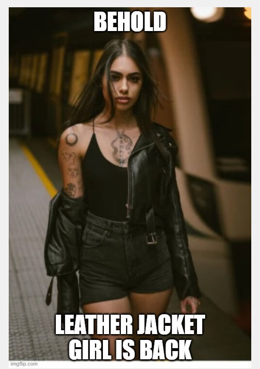
HELLO LEATHER JACKET GIRLS!
I felt a bit dirt going through these gorgeous women and casually clicking for more photos or to close the window. Like who was I to pick and choose from these amazing women?
Anyway. let me tell you what I’ve learnt in my journey.
1: It’s likely you’re going to have to cut people’s heads off.
The odds of you finding a perfect model that has the pose, expression, and that fits your author’s story is like finding the golden ticket from Wonker Factory. You’re going to have to cut people’s heads off and merge them. If you’ve been scorned by the Gods of Stock Photos, then you’re gonna have to go to rendered models. You gotta make sure the body and the face look the same direction, has the same size.
Then of course, you have to make sure the colours match, and the wherever our poor model has been beheaded or cut, make sure it’s seamless.
2: Background. Oh sweet mercy of unpaid work.
If you’re going with complete UF formula, you get the building background. This screams LOOK I AM SET IN MODERN LANDS. However, if you want it to actually tell more of your/author’s story, you gotta find the right background.
DON’T DO WHAT I DID AND LOOK AT COLOURS. It’ll be all washed out anyway, and the main thing will be the details of your background. DAMMIT.
So you pick your background, you may have to merge two, or three. or four. Or do a lot of brushing up/cloning. Then you put it on the back. You love it. GET READY TO COVER IT UP WITH OTHER STUFF.
Yeah. You end up putting your model in the front and throwing mad magic effects, particles, texture, and colours, you’re not really gonna see much of your background. It’s what the name says. It’s background.

3: Magic/effects galore
The magic I needed to work with was steam. So PUT BUNCH OF IT IN THERE. Warp tool is my friend. There was no way I was going to draw steam. Flares, glows, particle effects are galore in UF. There’s always gonna be purple, green, orange, yellow, blue lights
4: FONTS
Fonts are super important. Will you put the starting letters different from your other letters? Will you make them link? Where will you place them? Will you use serif? sans? Textures? Effects? Colour? I have to say 80% of the UF fonts I’ve seen have that metallic emboss to sans. Must be a thing.
Anyway! I’ve put it up on couple of facebook pages so it can be ripped into shreds XD Let’s see what the verdict is!