Book Cover Design

Work in Progress #3 - A Dash of Belladonna

Seems like getting a template is a tricky business. 

I finally wrote a blurb and sent it to my Copy Editor. 

So went to the template creator... and oh no. I now need an ISBN number. (Come on. I just want a template!) So off I go to my publisher - Lasavia Publishing to ask for one. 

Just waiting for that. 

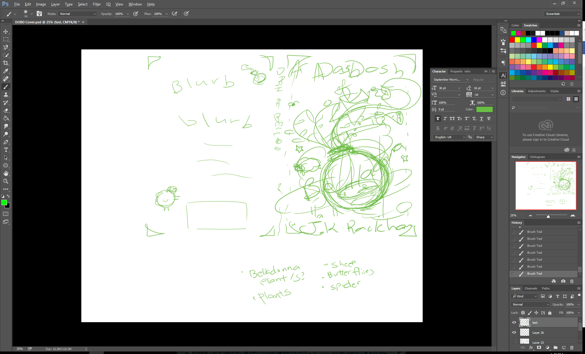
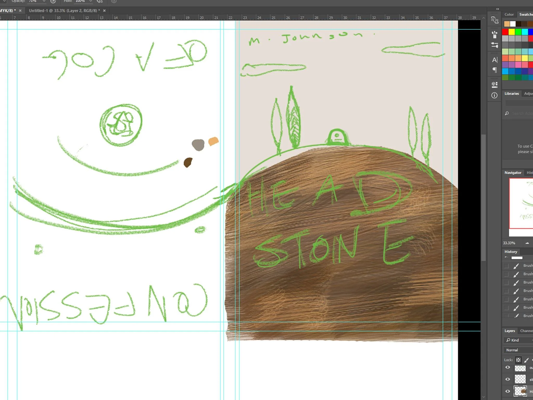
In the meanwhile - I've chosen a background color, and yes... I chose blue... green... I swear - it's only because it fit with everything in the page!

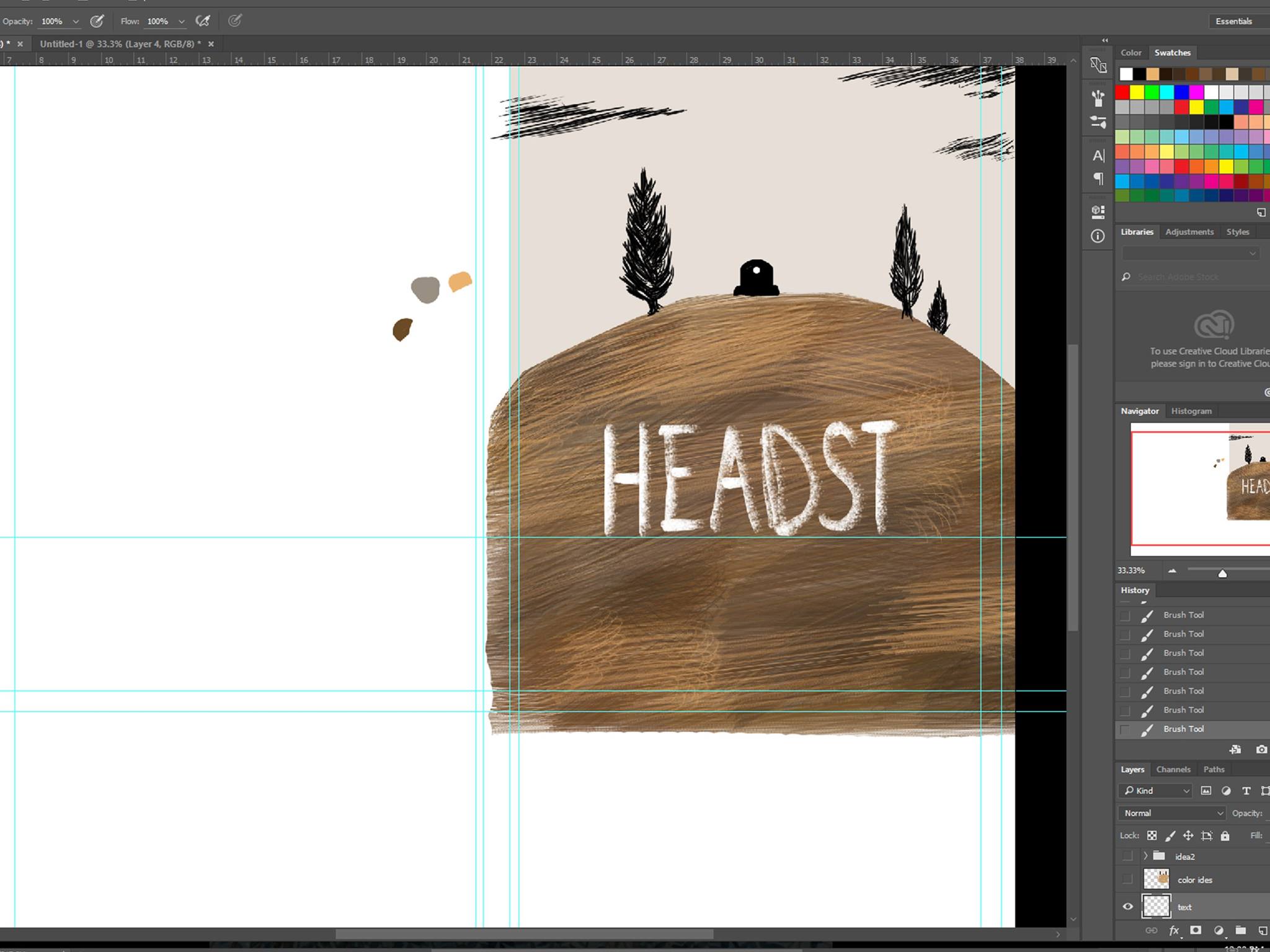
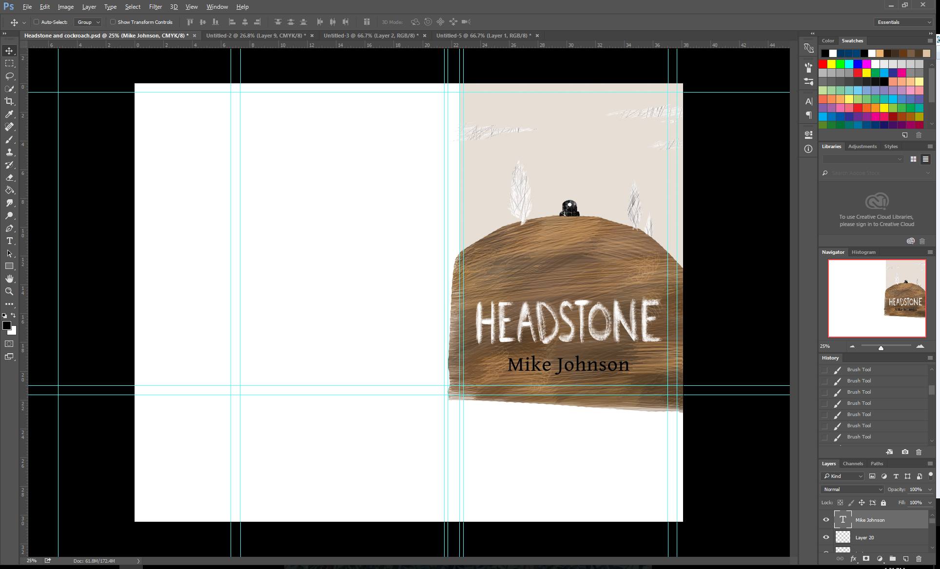
I've added more bits to the back - and touched up things I wasn't happy with (odd colors spilling out over the outlines etc) 

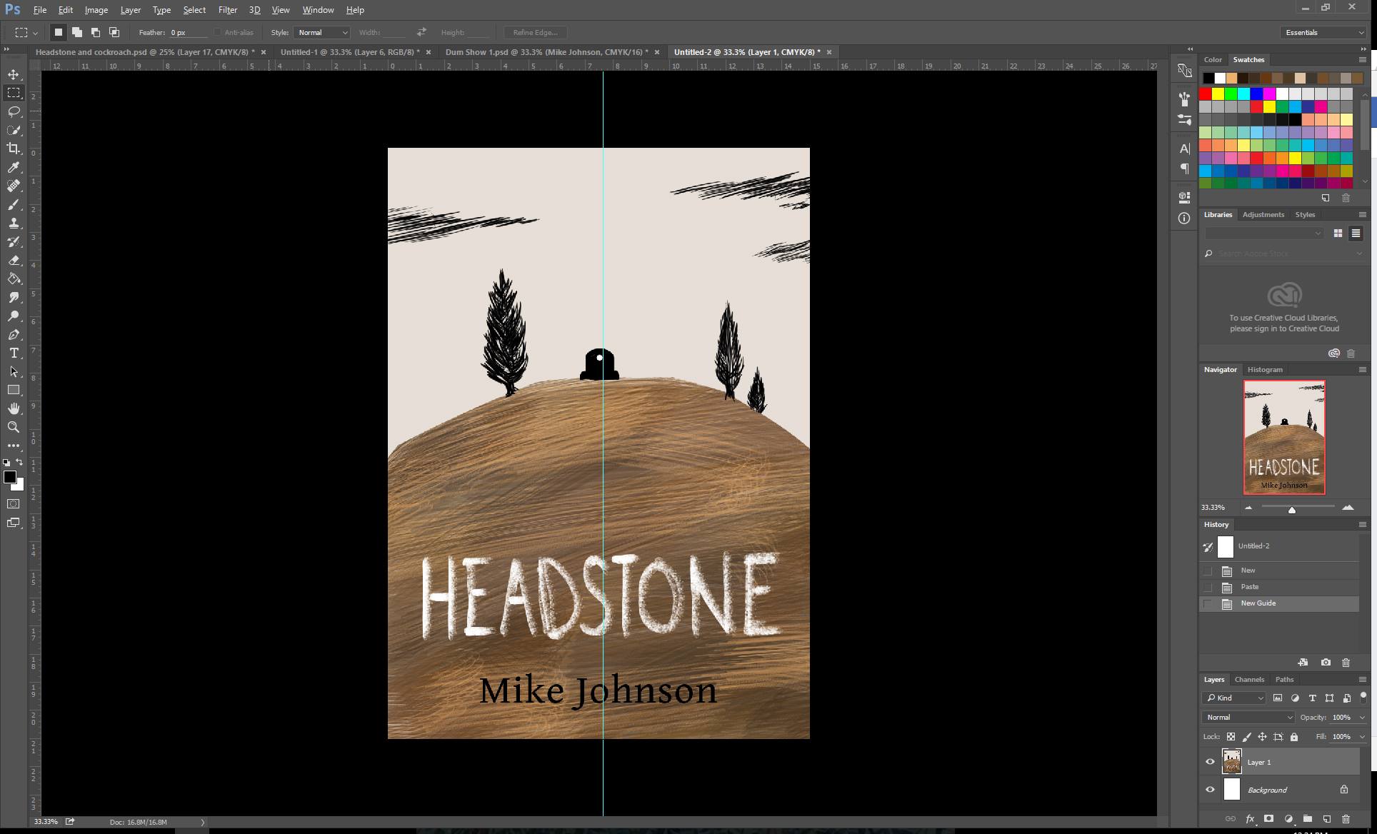
Added the logo! Lasavia Publishing is making a branch that will include YA, Fantasy and anything whimsical! I will be putting more energy behind it once this book is out, but I've made that logo. (You can see it in the logo section) We'll see how it will look like once I have that (*&@#(*&@*#(*&#&*^$#&!)en template! 

I hate templates. I think it's time I change my print on demand site. 

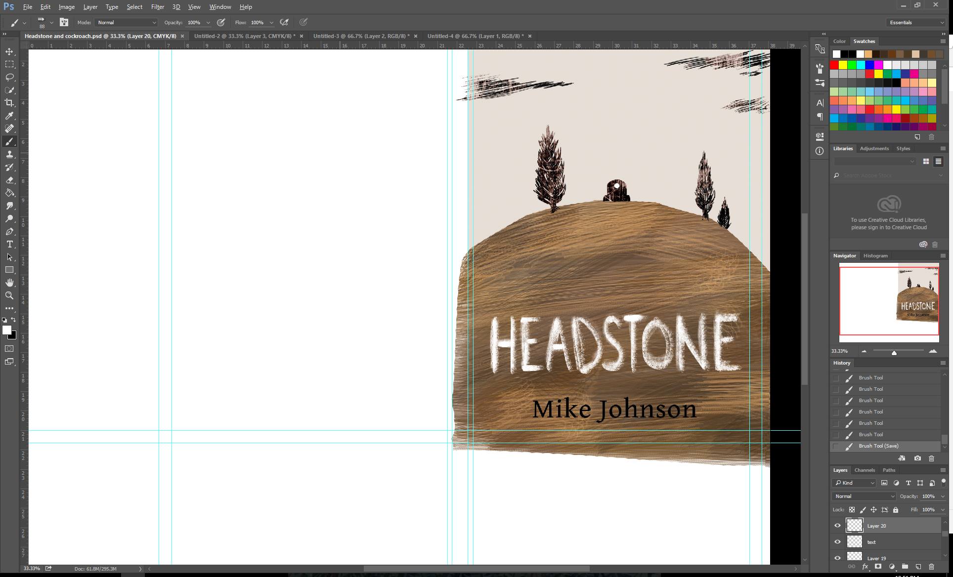
I'm pretty happy with how it's turning out to be. 

I originally had the idea that there will be these corner frames? but when I tried that, it just looked too busy. 

Once I have the template, I'll be able to design the spine and shift things! 

Once I have the blurb edited (I'd say having your blurb have grammatical/spelling mistakes is on the same level as being caught naked in your car? Yeah I don't know) I'll add it to the back. 

THEN DONE! Huzzah! 


Back to Blogs


Work in Progress #2 - A Dash of Belladonna

Thanks for the interest in my books guys! I still look at the manuscript and think "who would read this?" I think I'll be happy if ten people read my book and got a smile out of it :)

Anyway! I've been doing more work on it!

Yes - The Sheep (Her name is Fiona) Yes... I've changed her a bit. 

And added colors! 

And yes, yes- I've written the blurb. It's with the copy-editor to make sure it's all good before I put it anywhere!

So I'm playing with a lot of colors. I still haven't decided the back ground color. I was looking into a lot of books around my genre (YA? Fantasy?) And a lot of books are... blue. 

No seriously I'm not making a pun. They are blue. Dark blue, light blue... it's rare to see a yellow/orange/black/red shades.

So I decided what an impulsive writer/illustrator will do. JUST GO WITH THE FLOW. 

I have some background colors in mind but for now I'll just draw whatever colors I like and in the end see which compliments those. 

Goodbye pink smoke

Goodbye pink smoke

Here I've finally committed and merged all the lines into one. (They are now all called the Back Dove. Sounds like some code name for... weird... mission... thing.) I've deleted and smoothed out the lines where I needed depth and started to draw more colors and shading.

Banner width changed. Too much of the potion was obscured.

Next would be more details on the potion bottle... the bubbles... and the background color!!


Work in Progress - A Dash of Belladonna

I... forgot to take photos for the previous book cover while I was working on it... so uh... I'll do it with this one!

This one is very close to my heart since this is going to be my first novel! 
Eeeeeeee (well this is my second novel. My first novel's manuscript I've put it in a cabinet.) 

Currently it's with a copy-editor - so what can I do? Knuckle down and draw the book cover!

I thought of hiring someone else to do it... but I wanted to have a go at doing it myself. 

I actually had an idea for the book cover at the start of writing the book and even drew a mock cover. 

First try at my novel! The concept was to make it look like a diary. 

First try at my novel! The concept was to make it look like a diary. 

It wasn't bad - but I didn't think it represented what the story really was like. 

So back to the drawing board and voila!

Yuuuuup - thing of beauty, this.

Yuuuuup - thing of beauty, this.

How do I come up with ideas? I look at all the book covers. 

I look at book covers (thank you pinterest!) and save everything that jumps out at me. 

After I mass about 30-50 images, I look at them and try to think what drew me to them. 

The common points were:

* Colors - Cool colors
* Small pictures that represent the book
* Plants... (I had saved a lot of wedding invitations... I think I just love those watercolor foliage)

So - What else did I really want to put here?
* I wanted to put a potion in there with plants coming out of it. (That had to be my centre piece)

Now all these swirled in my head for about a week.

Then I sit down to draw that beauty up there.

Now - next step! Outlines!
 

A little better...

A little better...

I don't usually have separate layers for every item... but as it still is in experimental stage, I've kept everything separate. At this point - I am happy with the items in the book cover. 
I'm not really happy with the sheep... 
Items at the back... I'm going to think on it a little more before committing to a a thicker outline. 

Now - I should really get a template for my book cover since I more or less know how many pages my book would be... but to get a template... I have to write a blurb... description and bleeeeeeeuuugh. I'll just make the front and back first! Huehuehuehuehue. No wonder authors I work with are like "I"LL GIVE YOU THE TEMPLATE LATER - SOD OFF" whenever I ask them for it. 

Ugh that sheep keeps annoying me. What is it? Is it the angle? The size? 
Let me play with that... 

-To be continued-


In depth work in progress.

I've been getting few questions about how I do my work - and like - really. How exactly I do this. 
I don't have a secret when it comes to doing these work, so I thought I'd share my work :)

First step:

I talk to the client/author. As much as I appreciate their trust in me, I also want to know what they want in their book cover. If I don't have time to read their book, I ask them to tell me what their book is about. Usually they are amazing at giving me images and I can pick up what is important to them when they tell me what kind of stories they are telling. 

After this - it takes usually a week or two for it to brainstorm in my head. 

I look at A LOT of book covers. If anything jumps out - then I save them - look through them again. 

Once I have an idea, I sketch. 

Yes. Beautiful.

This book cover is meant to be 2 book covers in one book - so I'm going to work on the one to the right first. 
I put some colors I've had in mind to see what works. 
 

I've decided I was going to go with a rough, brush like feel with this cover. I've focused it being abstract, slightly strange and mute colors. 
Yup - I think I'm happy with this color. The tree kind of makes it into a face... maybe I'll keep it... It could be a metaphor... 

(At this point I have an idea what colors I want so I didn't have to do too many trials with colors. You can see I tried to see how it would look with a darker sky at the back, but it didn't work)

* If I'm stuck I go online and look at color pallets associated with the color I really want - and at this stage it's that beige color*


Details details

The hill came out darker... but I like it! Luckily I didn't have to make a brush for this - yay for photoshop brushes! Let's keep the hill like this and move onto the other things!

Moved onto drawing the stuff on the hills! I have a texture in mind for them so I wanted them as blocky as possible.. .but... mmm not much space. I can edit it later The hills look really empty. Let's move onto the Hills

Oh crap I ran out of space... (I usually don't use my own handwriting on book covers... but there's a bit in the book about chalk and.... no spoilers!)

6.jpg

Resizing and underline for... good measure? I'm having doubts... time to check with my assistant! (Husband) 
He just told me bluntly that it looks weird and that it looks like an adult is trying to pretend they are a child. Dammit husband. 
Time to rely on artist friends for second opinion! The underline seems a bit of an overkill at this stage...

Yes the underlines were overkill. Let's get rid of it. Okay - now next - that second opinion. It was pointed out that the the view is slightly to the left. Is it because of the spine? Let's cut it out and check it out. 
Nope - the eye does go slightly to the left. Let's see... the clouds and tree balance is good... let's move that tombstone. Nope - still to the left. 
It's the shape of the hills? Let's cut that hill a bit more. Eye focus is really important for a book cover!

Okay - cut the hill, shifted the things... make sure everything is centred...? Oh crap the text isn't really centred... but the text may change... so will leave it for now. Let's texture those suckers on the hill.


(Back to the usual view) 
Husband asked me to just handwrite it rather than using a font. He didn't believe me when I said I wrote that. He recommended it to be more 'chalk' like.

At this point I had to explain why I was using chalk to my two helpers. But then again you can't explain these things to readers... so hopefully they read the book and then click...

9.jpg

Textures in! But why do they look red... what... I'm sure I got rid of colors on my textures... I'll change that. Tried placing the author's name on the top but it didn't really work. So bottom it shall be! 
Maybe I should play with the author's text? It's always been that font... but same font means I can make all the books have something in common....

Hmmm now I'm playing with the idea of having everything except the tombstone white. It makes that pop out... but the sky looks empty... 
The author's name makes the hills feel a bit emtpy. 
Mm... the effect of an empty sky is pretty good... 
Can't really think of what to put there except more scratched clouds. Need time to think. Will eat food, maybe work on something else before going ahead. Break time.

Sky is too light! Let's add a darker color to it! I think I want more texture in the background... but for now I"ll work on the other side. 

Done! Well, kind of...

After talking to the Author about the setting, I've added the blazing field and contrast to make it a bit ominous. 

Now this is done, I put the words, probably Lorem Ipsum to show how the words would be.

Next part is waiting for the resident proof reader and the writer to give me quotes, reviews, blurbs! 

I made few mistakes with my old book covers where the blurbs and reviews weren't put through to the proof reader first... and that resulted in me going back and forth editing the reviewer's names... that wasn't fun. 

But the Publisher has it now! 

Once I have the words, I'll have to see what colors will work best with the fonts and placement of them.

80% done. 


Work in Progress #2

So here's my progress for the book. 

I had to talk to the writer about the type of (the amazing) tractor in this shot. He told me it's red, and it's 1950-60's Ferguson tractor. 
 

Rough position of the tractor - that looks so out of place right now

Rough position of the tractor - that looks so out of place right now

You can cal it the field of gold, you can call it the wreath of gold. I call it wow - when can I sleep today?

my hand hurts from the amount of dotting I've done for the wheat. It's not even half way done!! 

Luckily I had a brush with lots of spots - so I think I'll be spared from drawing so many dots in the middle. 

The tractor needs to change - it just doesn't look that great. 

The book itself is very grim, gothic style, so I thought instead of having the glittering gold field, to have the dark, overcast field. 


Work in Progress

Life and work never really goes as planned.

I was set on working on my next children's book with Mike Johnson, and another one with Rory Rackham, but we had a surprise contender who took away the match, the ring and even the bell. 

So, I'm in for a long haul, it's a huge project and I'll be devoting 2016 to it. (It's another children's book)

I'm midst of finishing the work I've promised to do, which is book covers!

Here's my WIP. 

Yes. Isn't this the most gorgeous book cover you've ever laid your eyes on?

Yes. Isn't this the most gorgeous book cover you've ever laid your eyes on?

Amazing. 

Let's see what happens to this after couple of hours...

Book Cover!

So for my first book cover which includes a real live model, I had asked my good friend to pose for me. 

I had an idea in my head and I figured I only needed her legs. 

So off I went to our location

Piha beach!

Piha beach!

and midst beach goers and their dogs, we got a lot of weird looks. 

Why? I had my model wear a super old but gorgeous wedding dress without any bridal make up or any props. 

I could almost hear people's whisper

"Where is her husband?" 
"Is this a 'I've been jilted' photo shoot?"

but my model stood firm as I kept telling her to stand in a certain way. 

Lesson learnt: Take photos of everything. 
regret not taking more photos of her entire body. I was so caught up in taking the photo of her legs, I only had few of her actual body. 

Look at those gorgeous dress. 

Look at those gorgeous dress. 

Luckily there were few I managed to snap. 

Only if I had money. I could have actually afforded a photographer who knew what they were doing.

So step 1 is done! 
 

Now to choose the photo to rule them all... I will find the right one based on:

* Lighting (I will be enhancing the photo with Photoshop, so I will need certain lights)
* Flow of the page (I need to really thing where the eyes will travel to.)
* Colors (I had the pleasure of reading her entire novel, so I know what atmosphere I want to create and yes, colors... oh how important they are)

Then I will have a panel of my most trusted advisors (friends and family) who will give me their opinions! But they won't sit in the same room, I will give them few choices and they will vote!

While this is happening, off I go to the wonderful world of fonts! My rule is that if the font is perfect for the story, BUY IT! BUY IT ALL Ahahahahaha!
I've come across few favorite fontsmiths... I'll make a list and put it up here later :)